6 Brochure Design Tips For Success
A powerful and effective brochure should clearly detail what your small business is about and what you can do for your customers. Alternatively, a poorly designed brochure will only ward off prospective customers to the open arms of your business competitors.
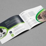
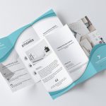
A brochure is a type of leaflet commonly seen on shelves or racks featuring a variety of information about a company, an event, a campaign, a product or a service. It is typically a single sheet that is either a bi-fold or a tri-fold. Some brochures are c-folded, while others are z-folded.
A brochure is merely a kind of leaflet that you will usually see on shelves or racks. A brochure is generally a single that can be bi-fold or tri-fold. Also, some brochures can be c-folded or even z-folded.
Brochure 101
People might think that brochures are no longer relevant. However, brochures are still very much alive. In fact, a professionally designed brochure can help you acquire new customers, improve sales, and grow your business.
Imagine that you attended a trade show or an event for a company that you’re not familiar with, how are you going to learn more about that company? The answer is through the brochures that they will give you. A brochure will provide you with information about the company’s products and services.
Tips To Design A Great Brochure
An excellent brochure can educate your potential customers, convey good reliability and power to the company, expand the target audience, and convince prospective customers to take action. For many graphic designers, creating a quality brochure is a challenge.
1. What is The Purpose of Your Brochure?
Before you jump right into the brochure design process, it’s essential that you know what the purpose of the brochure is. You should have a plan that clearly defines the goal of the brochure. Perhaps you want to acquire new customers, leads, and sales. Regardless of what you’re trying to accomplish, you should have a plan. If not, your brochure is not going to be effective.
2. Do You Know Your Customers?
If you’re going to do any form of advertising, you should know who your customers are. If not, you’re only going to waste your time and money. To make your brochure a success, you should have a good understanding of who your customers are and what they like.
3. Is Your Brochure Unique?
If you want your brochure to stand out from the crowd, you should make it unique. Try to be bold, different, never basic. The images, colors, and copy that you use should make your brochure stand out from what other business are doing. The goal is to differentiate yourself from your competitors.
4. Are You Using The Right Fonts?
Believe it or not, the fonts that you use can have an impact on how people respond to your brochure. Your brochure should be easy on the eyes. To do this, try to use standard fonts that most people use.
Here are some commonly used fonts that you should incorporate into your brochure:
- Helvetica
- Times
- Times New Roman
- Courier
- Courier New
- Verdana
- Tahoma
5. Get Straight To The Point
Sometimes you have to get straight to the point. You shouldn’t ramble on about your products and services. Try to get straight to the point of the message that you’re trying to get across with your brochure.
6. Avoid Using Big Words
It’s not unusual to try and use eloquent speech in your brochure. However, that doesn’t mean that your audience will be able to connect with the words that you use. In fact, the more prominent words that you use, the less credible you’ll be. The truth is that you shouldn’t try to impress your audience with big words. Try to use small words in your brochure that people will understand without having to get a dictionary.


