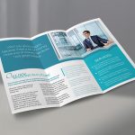
How To Create The Best Brochure
Creating the best brochure is very essential for marketing and advertisement purposes, because it is a very simple, eye catching and creative way of introducing one’s products and services to customers and target market. They (brochures) are usually colorful leaflets, flyers or pamphlets that can come in various but standard sizes or shapes, usually 8.5’’ x 11’’. Brochures may come in digital form. The papers of a brochure are generally similar to the ones used in making magazines and other heavy papers.
The few points are listed below might be taken into consideration if one wants to create an outstanding brochure.
- CONSUMERS: Put your readers first. Learn who your target audience is, their age group, their social class and their lingua. If your brochure is being designed for college or university students, the colors, shape, size, font and even the grammar used will be very different from that used for a brochure designed for pupils in elementary or primary school.
- PURPOSE/ INTENT: Why are you making a brochure? Are you introducing a new commodity to the market or you are trying to boost a product that is already on the market? Do you need a certain group of people to see it or its for general consumption? Take note of these things, they could be very essential in passing across your message.
- APPEAL: An appealing brochure draws attention. A brochure can be made appealing by addition of colors, use of shapes and fonts of different sizes. Graphic designs can also bring your brochures to the eye easily. All this attracts more people. It is easier to pick up a colorful book than a black and white one, especially if your audience is young.
- PORTABILITY: A brochure should be easy to carry around, fit into pockets, satchels, purses without any hassle. That way it will be easier to get into the hands of more people. Anything bigger might seem stressful and unpleasant to move around with. Smaller might even be better.
- FUNCTION AND LEGIBILITY: Placing focus on making your brochure legible for readers of all ages is a very good idea. A way you can do this is by using huge fonts for your letters and also placing light colored letters on dark colored backgrounds and vice versa (dark colored letters on light colored backgrounds). Brochures with smaller fonts might be harder to read for some people, and they might not have the patience to try to decipher it.
- FEEDBACK: A brochure should not just pass information from you to your target market, it should also consist of a means by which they can contact you or give you feedback, if need be. This is very essential. An email address, a Facebook, Twitter, Instagram username, a phone number are the most popular means of contact nowadays. One of more of these should be sufficient.
- STRAIGHT TO THE POINT: A proper brochure is expected to be straightforward, not watered down, and devoid of unnecessary information. Too much beating around the bush could divert attention from the information being passed across or even make said information lose its meaning.
At the back of the mind of everyone making brochure should be this major point; GET THE NEWS OUT AS LOUD AND AS EFFECTIVELY AS POSSIBLE. This is the main reason why brochures are made, to pass across information to the right people, at the right time, in the right places.


