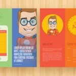
5 Things To Consider For Effective Brochure Design
Brochures are an effective marketing tool that is used by business owners to advertise a product or service to their customers or to reach a targeted audience. Brochures are more than printing a couple of messages and distributing them to people but are a market changer and profit generating means for businesses.
To effectively pass any information about your company, a well-designed brochure is important. Five factors to consider when designing a brochure are:
Choose an Eye-catching Layout
This is the first thing that most people notice when a brochure is handed to them. The layout should consist of the kind of information it will contain, the target audience, the number of pages, and how to distribute the necessary information without stuffing it. In addition, the design of the layout should be simple with beautiful colors intensifying the message in the brochure.
Choose the Right Content
You have heard it before, content is king. A brochure is a promotional and marketing piece of document. Getting the right content is a vital part of the design. The brochure content must contain text, images, contact details, inquiry phone number, the price of the product, and services displayed in the brochure. The font should also be easy to read and consistent. Before any brochure is sent for printing; it should be proofread and edited to make sure that all information provided is correct.
Focus on your Target Audience
The brochure is meant for an audience, so let it speak and engage with them. With that said, the brochure should be created from the viewpoint of the reader. Many readers don’t read the entire brochure, so information should be placed at strategic areas to attract the audience and keep them looking through the brochure for more than minutes.
Choose Memorable Headings
As with other marketing tools, the brochure does the same thing – capture a new market. To get the reader to read through a brochure, get a headline that triggers an emotion in them. For example, a travel brochure can have a heading like travel by air Thailand for less and get free hotel accommodation for 3 nights. This will get travelers scrabbling to check out the deal and get calls through for further information. In addition, use graphics, charts, and colorful heading to simplify the message to the reader. Add testimonials and an FAQ section to clear consumers doubt about a particular issue.
Add a Call to Action
This is what you want the customers to do after looking through your brochure. Make the call to action user-friendly and easy to perform. The call to action can be as simple as directing the readers to keep their brochures for further reference or to get a free consultation on a service the company provides, and a do this for a free monthly bonus. This will attract the reader and get them to heed the call to action.
Conclusively, a well-designed brochure should inform, advertise, and create more visibility of your products and services to a broader market.


