TRI-FOLD BROCHURE DESIGN TIPS
TRI-FOLD BROCHURE DESIGN TIPS
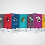
Majorly as a graphic designer, tri-fold brochure designs used to be rare, they weren’t really an everyday job request; but slowly, they are becoming a staple in the marketing world. They are made by having a 8 x 11 Sheet of paper folded twice to create three panels on each side. It is the brochure type used by small businesses because it is easily folded into standard envelopes, they are also used by universities when they intend on advertising their prospective and standards, they are used in writing order of programs, in dinner settings, church settings, etc.
Here are some tips to getting it perfectly done:
- KNOW THE PURPOSE OF THE BROCHURE: it is not ok to just collect the job and fix the typing, logos and other statements in place; know what it is for- knowing this would drive you, it helps you know when less is more or if presence is less. Know if it is for a dinner event, a seminar, church program, mere advertising, etc. No information is a waste.
- SET YOUR MARGINS CORRECTLY: I cannot help but over emphasize on the importance of this, you are having margins in between the panels, both the left and the right must be equal when the brochure is folded, you can ensure it is so by making the margins in between the middle panels doubled, so when they are folded into two, it is equal to the margin outside; this gives the work uniformity; get this wrong and you have a messed up Tri-fold brochure.
- THE ORDER OF INFORMATION IS KEY: you should know that each part of the brochure is holding information; that information must be arranged in a way that does not bore the viewer. You must understand the part of the brochure that is immediately seen, and the part that is unavoidably noticed and it is there you place critical information: for example, you do not put critical information on the far right panel when the brochure is opened, it can be easily overlooked. The inner three-panel spread is for description and the far-right would be better left for conclusion or other less important information. Understand that the panel is narrow so you have to conserve space, let the critical information be in the inner area but not at the far right.
- YOU ARE SAFER WHEN YOU USE A TEMPLATE FROM YOUR PRINTER: it is true that there are a lot of templates online but if your printer provides you with one, it is better you use it, having a template from your printer ensures that you are correct with the size of the flap amongst other things and most importantly, it matches the printer when printing is next.
- PRINT AFTER MOP-UP: it is better to have a hard copy sample which you would fold yourself before you go for mass printing, it helps you to ensure the margins align, if you rely on what you see on your computer, you might be shocked to see it doesn’t fall to place at mass printing. So, print it, fold it and make the corrections if need be.
In making a tri-fold, practice and more practice is the key, understand you have a limited space, work with it- it is tasking, but with time, it works out well, and keep these tips in mind.