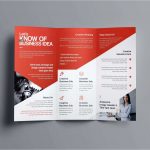
10 Effective Tips for Postcard Design
Are you getting the desired result from you postcard? If not, below are 10 effective tips to help you create an impactful design to yield better result. Your postcard must grab the attention of reader and in turn increase your customer base and more money in your pocket.
10 Effective Designs are
Know Your Audience: Your audience should take center stage when designing the postcard. If your audience is young, savvy, and smart people, the postcard should speak to them and enhance their lifestyle and attitude. The demographic should set the tone of the card.
Keep it Simple and Short: The message should be short and direct, even as little as two sentences are enough to get the attention of your audience. Choose bold, eye-catching, and attention-grabbing headline as your heading and experiment with different designs before settling on one that embodies your brand and ideas
Be in love with the White Spaces: Use the white space to add color and fun to your postcard design. The white space adds extra beauty to any postcard and creates an appealing look to your customers.
Supersize it: To distinguish your brand from the competition, try using a bigger size paper like a 6 x 9 inch or a 9 x 11 inch to create postcards impossible to ignore by the readers.
Use Quality Prints: It makes no sense to have good ideas that a bad print spoils. Never ever compromise on the quality of the print, no matter what, else you lose customers.
Choose the Right Font and Color: A major part of the postcard design is the font and color used. If you are speaking to an older audience; large fonts will help them see the message clearer and better
Use Compelling imagery: Don’t settle for plain, lifeless images that drain energy from your message and tarnishes the idea you have about the card. The image should speak to the people and enhance your message to the particular demographic.
Think the Format through: Keep the postcard clean and simple without overcrowding it with pictures and texts. Use contrasting elements as colors and texts to create an effect on the postcard. Make sure that the background colors don’t swallow the text, but the card look profession and unique.
Choose the Right Paper: Depending on your audience, choose a paper that will deliver the message. A light paper will tear easily or blown away by the wind, but a hard and thick paper will prevent the print ink from running or bleeding into the background color and can’t be disposed of by customers.
Use the Back of the Postcard: utilize all the space available. Write the message and call to action on the front and use the back for any extra details that will motivate the reader to perform the call to action on the postcard
The following should get you started on an effective design for any postcard of your choice.


